在這章我們將學(xué)習(xí)到:
1.Fixed- and flexible-width rounded-corner boxes
2.The sliding doors technique
3.Mountaintop corners
4.CSS drop shadows
5.PNG transparency support for Internet Explorer 5.x and above
6.Image replacement
基本的背景圖片
body {
background:url(pattern.gif);
}
body {
background: #ccc url(gradient.gif) repeat-x;
}
#branding {
width: 700px;
height: 200px;
background:url(/images/branding.gif) no-repeat;
}
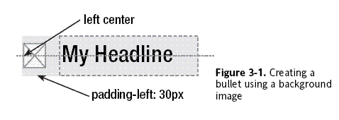
h1 {
padding-left: 30px;
background: url(/images/bullet.gif) no-repeat left center;
}
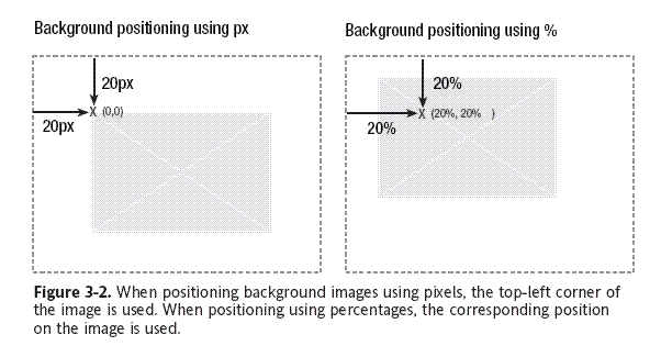
h1 {
padding-left: 30px;
background: url(/images/bullet.gif) no-repeat 0 50%;
}
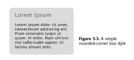
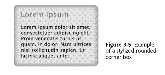
Rounded-corner boxes
.box {
width: 418px;
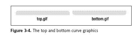
background: #effce7 url(images/bottom.gif) no-repeat left bottom;
}
.box h2 {
background: url(images/top.gif) no-repeat left top;
}
.box h2 {
padding: 10px 20px 0 20px;
}
.box p {
padding: 0 20px 10px 20px;
}
<div class="box">
<h2>Headline</h2>
<p>Content</p>
</div>
.box {
width: 424px;
background: url(images/bg-tile.gif) repeat-y;
}
.box h2 {
background: url(images/bg-top.gif) no-repeat left top;
padding-top: 20px;
}
.box .last {
background: url(images/bg-bottom.gif) no-repeat left bottom;
padding-bottom: 20px;
}
.box h2, .box p {
padding-left: 20px;
padding-right: 20px;
}
<div class="box">
<h2>Headline</h2>
<p class="last">Content</p>
</div>
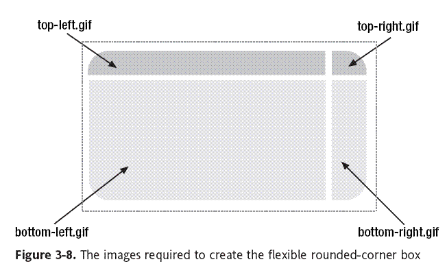
Flexible rounded-corner box
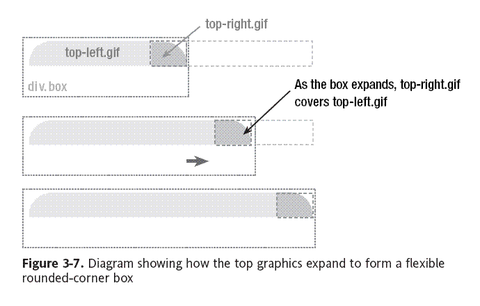
.box {
width: 20em;
background: #effce7 url(images/bottom-left.gif)
no-repeat left bottom;
}
.box-outer {
background: url(images/bottom-right.gif) no-repeat right bottom;
padding-bottom: 5%;
}
.box-inner {
background: url(images/top-left.gif) no-repeat left top;
}
.box h2 {
background: url(images/top-right.gif) no-repeat right top;
padding-top: 5%;
}
.box h2, .box p {
padding-left: 5%;
padding-right: 5%;
}
<div class="box">
<div class="box-outer">
<div class="box-inner">
<h2>Headline</h2>
<p>Content</p>
</div>
</div>
</div>
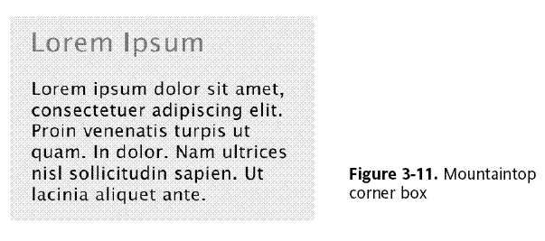
Mountaintop corners
.box {
width: 20em;
background: #effce7 url(images/bottom-left.gif)
no-repeat left bottom;
}
.box-outer {
background: url(images/bottom-right.gif) no-repeat right bottom;
padding-bottom: 5%;
}
.box-inner {
background: url(images/top-left.gif) no-repeat left top;
}
.box h2 {
background: url(images/top-right.gif) no-repeat right top;
padding-top: 5%;
}
.box h2, .box p {
padding-left: 5%;
padding-right: 5%;
}
<div class="box">
<div class="box-outer">
<div class="box-inner">
<h2>Headline</h2>
<p>Content</p>
</div>
</div>
</div>
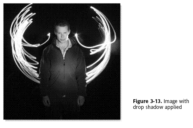
Drop shadows
Easy CSS drop shadows
.img-wrapper {
background: url(images/shadow.gif) no-repeat bottom right;
clear: right;
float: left;
}
.img-wrapper img {
margin: -5px 5px 5px -5px;
}
<div class="img-wrapper"><img src="dunstan.jpg" width="300"
height="300" alt="Dunstan Orchard" /></div>
.img-wrapper img {
background-color: #fff;
border: 1px solid #a9a9a9;
padding: 4px;
margin: -5px 5px 5px -5px;
}
.img-wrapper {
background: url(images/shadow.gif) no-repeat bottom right;
clear: right;
float: left;
position: relative;
}
.img-wrapper img {
background-color: #fff;
border: 1px solid #a9a9a9;
padding: 4px;
display: block;
margin: -5px 5px 5px -5px;
position: relative;
}
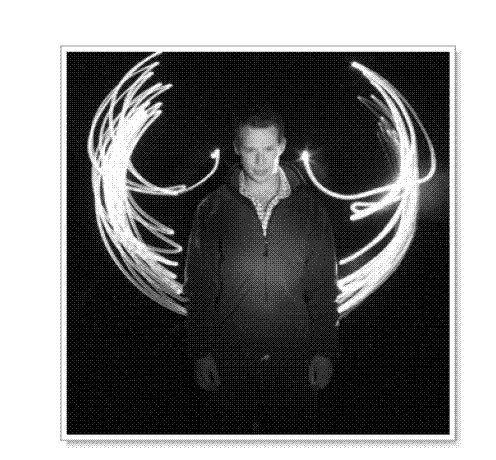
Drop shadows a la Clagnut
.img-wrapper {
background: url(images/shadow.gif) no-repeat bottom right;
float:left;
line-height:0;
}
.img-wrapper img {
background:#fff;
padding:4px;
border:1px solid #a9a9a9;
position:relative;
left:-5px;
top:-5px;
}
Fuzzy shadows
.img-wrapper {
background: url(images/shadow.gif) no-repeat right bottom;
float: left;
}
.img-wrapper div {
background: url(images/mask.png) no-repeat left top !important;
background: url(images/mask.gif) no-repeat left top;
padding: 0 5px 5px 0;
float: left; /* :KLUDGE: Fixes problem in IE5.2/Mac */
}
.img-wrapper img {
background-color: #fff;
border: 1px solid #a9a9a9;
padding: 4px;
}
<div class="img-wrapper">
<div>
<img src="dunstan.jpg" width="300" height="300" alt="Dunstan" />
</div>
</div>
Onion skinned drop shadows
.img-wrapper {
background:url(images/shadow.gif) no-repeat right bottom;
float: left;
}
.img-outer {
background:url(images/bottom-left2.gif) no-repeat left bottom;
float: left; /* :KLUDGE: Fixes problem in IE5.2/Mac */
}
.img-inner {
background:url(images/top-right2.gif) no-repeat top right;
padding: 0 5px 5px 0;
float: left; /* :KLUDGE: Fixes problem in IE5.2/Mac */
}
.img-wrapper img {
background-color: #fff;
border: 1px solid #a9a9a9;
padding: 4px;
display: block;
}
<div class="img-wrapper">
<div class="img-outer">
<div class="img-inner">
<img src="images/dunstan.jpg" width="300" height="300"
alt="Dunstan" />
</div>
</div>
</div>
Image replacement
Fahrner Image Replacement (FIR)
h2 {
background:url(hello_world.gif) no-repeat;
width: 150px;
height: 35px;
}
span {
display: none;
}
<h2>
<span>Hello World</span>
</h2>
Phark
h2 {
text-indent: -5000px;
background:url(hello_world.gif) no-repeat;
width: 150px;
height:35px;
}
<h2>
Hello World
</h2>
Gilder/Levin method
h2 {
width: 150px;
height: 35px;
position: relative;
}
h2 span {
background: url(hello_world.gif) no-repeat;
position: absolute;
width: 100%;
height: 100%;
}
<h2>
<span></span>Hello World
</h2>
posted on 2007-04-03 14:44
尨奇 閱讀(539)
評(píng)論(0) 編輯 收藏 所屬分類:
CSS