//轉自:http://www.richinternetapps.com/index.html
My first thought was to suggest the creation of a custom cell renderer, an example of which ships with Flex. However, I then remembered that the List control in Flex has an iconField property, which can be used to specify an image that will appear next to each item in the control. An example MXML file using the iconField property with the List control is as follows:
<?xml version="1.0" encoding="utf-8"?>
<mx:Application xmlns:mx="http://www.macromedia.com/2003/mxml" >
<mx:Script>
[Embed(source="one.png")]
var iconSymbol1:String;
[Embed(source="two.png")]
var iconSymbol2:String;
[Embed(source="three.png")]
var iconSymbol3:String;
</mx:Script>
<mx:List iconField="icon" >
<mx:dataProvider>
<mx:Array>
<mx:Object label="One" icon="{ iconSymbol1 }" />
<mx:Object label="Two" icon="{ iconSymbol2 }" />
<mx:Object label="Three" icon="{ iconSymbol3 }" />
</mx:Array>
</mx:dataProvider>
</mx:List>
</mx:Application>
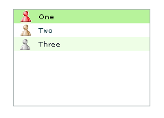
The above MXML uses the iconField property of the List control to retrieve the icon property from each item in the control's data provider, and produces the following List control (image only):
圖片如下:
But (and isn't there always a but?), the poster to FlexCoders wanted the icons not in a List, but in a ComboBox and, such is fate, the Flex ComboBox does not have an iconField property.
However, those who have looked into the Flex components in any detail will know that the ComboBox control uses the List control internally, to display its own drop down portion. So, I delved into the classes to see what I could find and the result of that find was as follows:
<?xml version="1.0" encoding="utf-8"?>
<mx:Application xmlns:mx="http://www.macromedia.com/2003/mxml" >
<mx:Script>
[Embed(source="one.png")]
var iconSymbol1:String;
[Embed(source="two.png")]
var iconSymbol2:String;
[Embed(source="three.png")]
var iconSymbol3:String;
</mx:Script>
<mx:ComboBox id="theCombo"
creationComplete="theCombo.getDropdown().iconField='icon'" >
<mx:dataProvider>
<mx:Array>
<mx:Object label="One" icon="{ iconSymbol1 }" />
<mx:Object label="Two" icon="{ iconSymbol2 }" />
<mx:Object label="Three" icon="{ iconSymbol3 }" />
</mx:Array>
</mx:dataProvider>
</mx:ComboBox>
</mx:Application>
圖片如下:
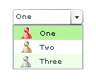
Simple! The highlighted code shows that we can get the List portion of the ComboBox control using the getDropdown() method of the ComboBox, and set its iconField property in the same manner as we did with the List control previously. For those that haven't yet investigated Flex in any detail, the creationComplete property allows us to define a handler that will run when the component instance has been created.
There is one further point worth noting - the original poster wanted to be able to change the icon at runtime - the solution above does allow that. We can add the following to our MXML file so that when the user presses the button, the icons are rotated through the items in the dropdown.
<mx:Button label="Rotate Icons" click="rotate();" />
<mx:Script>
<![CDATA[
public function rotate() : Void
{
var firstIcon = theCombo.dataProvider[0].icon;
for ( var i = 1; i < theCombo.dataProvider.length; i++ )
{
theCombo.dataProvider[i-1].icon = theCombo.dataProvider[i].icon;
}
theCombo.dataProvider[theCombo.dataProvider.length-1].icon = firstIcon;
theCombo.bLabelFieldChanged = true;
theCombo.invalidate();
theCombo.dispatchEvent({type:"labelFieldChanged"});
}
]]>
</mx:Script>
The for loop in the rotate() method is self-explanatory, but the last three lines in the method need further explanation. Because we are changing the underlying List component of the ComboBox, the ComboBox icons are not updated when we update the data provider. By including those three lines (which are what are called when the labelField property of the ComboBox is changed), the ComboBox is tricked into redrawing its drop down items. This is a quick and dirty way to get it working - I'm going to investigate a better solution.
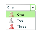
After the user has pressed the button (which is hidden under the drop down portion of the control), the ComboBox looks as follows, with the icons having moved:
圖片如下:
The obvious next step in the development of the above is to extract the code to a new component, which could then be used within any application. We'll show how that can be done in a future blog entry.
This example does show the power of Flex,