2007年標志設(shè)計趨勢密碼
2007 Logo Design Trends
2007年1月發(fā)表,1月24日由Quester中文翻譯,原文鏈接:http://logoorange.com/logo-design.php
11 trends that will define Logo design in 2007
Everyone wants to set the curve when it comes to style. No one wants to design out of a book of trends, but nevertheless, they emerge.
Take a peek at the following 11 Logo design trends that we think will define the look of 2007.
11種趨勢將定義2007年的Logo設(shè)計
每個設(shè)計師都想在某一風格成為流行前把握它。沒有人愿意自己的設(shè)計和流行趨勢脫節(jié)。但是無論如何,這些趨勢總是會露出端倪。
讓我們一同來窺探一下這11種我們認為的2007年標志設(shè)計的趨勢密碼。
|
1. Talk Boxes
This is an outgrowth of last year's trend, even though these boxes have been around a few years now.
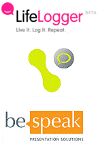
We don't quite know who's doing the talking, but whoever it is, their bubble is popping up all over. This Logo symbolizes communication, whether it be from the company or between its customers. LifeLogger, for instance, uses a speech bubble with a smile in it to illustrate how users can communicate through them to friends. They continue the use of three-dimensional speech bubbles in creating avatars for their users, as illustrated to the right.
In this way, the idea of communication represents the person themselves, showing the importance of contact.
|
|
|
1. 對話泡泡
這是一種去年的流行風格的衍生,盡管這些泡泡已經(jīng)玩了好幾年了。
我們搞不懂是誰在說話,但管它是誰呢,反正滿處都是冒的這些泡泡。這個符 號象征著溝通,無論是來自企業(yè)還是他們的客戶之間。LifeLogger(生活的記錄者)網(wǎng)站,是一個例證,用泡泡和微笑符號來說話,表明用戶可以用什么 樣的方式和他們的朋友來交流。 他們繼續(xù)使用立體的對話泡泡來為用戶創(chuàng)造神話,就像右邊那個泡泡。
在這里,溝通的想法代表這些人本身,想要展示接觸的重要性。
|

|
2. Clouds
Everyone remembers a time when they laid on their back in the grass, staring at the clouds daydreaming or finding images in their puffs.
Clouds are a powerful Logo, conjuring imagery of dreams, creativity and playfulness. Sometimes clouds are combined with thought bubbles to invoke feelings of dreaminess. The clouds can be a 3D bubble or take on a flat feeling. Many of these cloud Logos represent new ideas, hence the thought bubble. Many "clouds" came from new businesses on the internet, certainly a place for dreamers. Some, also include imagery of the sun, which evokes a feeling of a new dawn.
|
|
|
2. 云狀物
每個人都有那些仰面躺在草地上的時候,望著云朵發(fā)白日夢或者從騰云變換中尋找圖案的記憶。
云狀物是一個極有表現(xiàn)力的標志,憑空幻化意象,即有創(chuàng)造性,又很好玩。有時候云狀物和“思維泡泡”結(jié)合起來,會產(chǎn)生一種夢幻的感覺。云狀物可以是三維的泡泡或者只是平面的。許多的云狀物Logo用“思維泡泡”來代表一種新思想。
許多的“云朵”來自互聯(lián)網(wǎng)上的新生意,互聯(lián)網(wǎng)確實是個夢想之地。有一些,也包含太陽的圖形,用來形成“新的曙光”的感覺。
|

|
3. Reflections
Mirror, mirror, on the wall, what's the hottest trend of all? It might just be reflections. With Apple leading the way, looking like all their graphics were set on a shiny table, others are sure to follow. Dubbed by some as ?the new drop shadow,? reflections are taking over, especially on the web. The reflections might be skewed, such as in the Logo for blinklist, indicating the location of some light source, invisible to the onlooker, but effective in creating even more of a sense of a whole different world the Logo is in.
|
|
|
3. 反射效果(鏡像效果)
魔鏡魔鏡告訴我,什么是最熱的潮流啊? 它可能就是“反射效果”。蘋果最先開始倡導的,把什么東西都弄得好像放在光滑閃亮的桌面上,其他人就開始跟風。有人給它起了個綽號叫什么來著?“新的下拉 陰影”(意思和以前的“下拉陰影”效果一樣滿天飛)。 “反射效果”全面霸占,尤其是在網(wǎng)上。反射效果可以是不對稱的,就像 blinklist 的Logo一樣,弄出一些光的效果卻讓你找不到光源,但對于創(chuàng)造擁有更多“完全不同的世界”感覺的Logo是有效而時尚的。
|
|
4. Rectangle
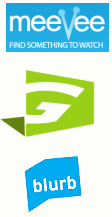
In a graphic world where you can do nearly anything, some companies are keeping it simple with shaded rectangles. Their Logo, in a contrasting white, pops out from the background. Shadow boxes have historically been a sign of amateurish design, but this new generation of effective Logos has shown that good design will always be in style. With the popularity of rounded corners, these Logos stand out with (oh no!) sharp edges and right angles. In some occasions, such as with the blurb Logo, the rectangle can represent an image. Blurb used their blue shadow behind their name to symbolize a book, as they are in the book publishing business.
|
|
|
4. 長方形
在圖形世界里,你幾乎可以做任何事情,但有些公司只使用簡單的帶邊框的長方形。他們的Logo,從高反差的白色背景上“跳”出來。相框一樣的長方形 容易給人“業(yè)余設(shè)計水平”的感覺,但是新生的有活力的這些Logo,表明了好的設(shè)計永遠都是有品味的。與人氣極旺的圓角風格同時,這些Logo因有著銳利 的邊緣和適當?shù)膬A斜角度而特別顯眼(不是吧!)。在某些場合,就像 Blurb的Logo,長方形可以用于扮演一個形象。Blurb 用藍色的圖形放在名字后面來代表一本書,因為他們做的是圖書出版業(yè)務(wù)。
|
?
|
|
5. 3d Puffies
With these new puffed-up Logos, you don't know whether to click on them or bounce on them. Now that the industry has overcome the production issues of gradients, designers seem to prefer air-popped graphics to the flat drawings of yore. Even desktop icons these days seem to have a rounded feel, like you might pop one with one good hard double-click. It's a 2D world out there in Internet land, and these 3D images really make Web pages and Logos jump out of the page, to where you feel you could run your hands over the computer screen and feel their bumps and curves.
|
|
|
5. 立體發(fā)泡物
這些新出現(xiàn)的圓鼓鼓發(fā)泡Logo,讓你搞不懂到底是在上面點擊還是在上面彈跳。自從工業(yè)生產(chǎn)克服了“漸變色”的難題,設(shè)計師們就似乎熱衷于將“立體 彈出”的圖像加到以往的平面圖樣中。甚至桌面圖標在最近也看起來有圓乎乎的感覺,就像你用力一點擊它就會彈得老高。二維的世界已經(jīng)從互聯(lián)網(wǎng)走開了,三維的 圖像的確讓網(wǎng)頁和Logo“跳出”頁面,進入一個你可以用手指滿屏幕去感覺那些凹凸不平和曲線的新世界。
|
|
|
6. Hot Dogs
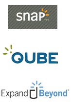
These cute little Tic Tacs of color are popping up all over the design world. Like many abstract symbols, the hot dogs can be used to mean many different things. Sometimes they denote movement or sound, such as in the Logo for Snap. These lines, reminiscent of those drawn out of shocked cartoon people by children everywhere, can denote an idea, a feeling or a literal meaning. But no matter how they're used in design, they are a powerful symbol of an upbeat emotion.
|
|
|
6. 熱狗腸
這些色彩和彈出的可愛小把戲遍布了整個設(shè)計界。像許多抽象符號一樣,熱狗腸可以用來表示許多不同的東西。又是他們表示聲音或運動的 警示,就像Snap的Logo里那樣。那些輻射的線條,讓人想起隨處可見的小孩子畫的 大吃一驚的 卡通人物。它能表示一種想法,一種感覺或者只是一種 字面上的意義。但不管它們用在設(shè)計中是為什么,它們都是一種有強烈表現(xiàn)力的符號來象征 樂觀的態(tài)度。
|
|
|
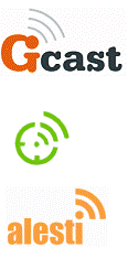
7. Transmission beam
With satellite tv and radio and wireless everything all the rage in the new millennium, a transmission beams are a quick way to show that they are on the cutting edge of technology. Many companies who use this Logo trend deal in internet information. Part of what many of these companies are doing on the internet is taking user (or customer) information and sharing it with the world. The transmission beam, starting with a single dot (to represent the user), shows their ideas spreading out. It's the perfect symbol for publishing companies or blog sites.
|
|
|
7. 發(fā)射電波
衛(wèi)星電視,電臺和無線的東東在新紀元里遍地開花,用發(fā)射電波是最快捷方式來表明他們是站在科技的最前沿。用這種Logo的許多公司都在做互聯(lián)網(wǎng)信息 生意。他們中間有許多公司做的是在互聯(lián)網(wǎng)上獲取用戶(客戶)資料然后分享給全世界。無線電波,始發(fā)于一個“點”(代表用戶),體現(xiàn)他們的理念在傳播。對于 出版公司和博
|
?
|
|
8. People
AOL's little man has some company, with others creating buddies to include in their Logos. For companies that bring people together, these genderless little people are shown in pairs or groups. They provide a visual indicator of coming together. Others show just one of these symbols, usually as an avatar for their customer. Anyone looking for other people can be sure they've found them when they see a Logo with a buddy.
|
|
|
8. 人形
美國在線的“小人”已有了幾個軍團,和其他正在創(chuàng)建的好友一起都歸屬在它的Logo旗下。軍團將人聚在一起,把這些搞不清性別的人成對或成組排列。 他們?yōu)椤熬墼谝黄稹碧峁┝诉@樣一個視覺指示。有些公司的Logo只展示符號中的一個,這通常作為他們客戶的偶像。任何想找人的人,當他們看到有這個 Logo的哥們,就能確信自己可以找到隊伍。
|
|
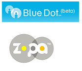
9. Transparency
Transparency is still hot. Again, many may gasp as the mere though of using a shadow, but this updated version is nothing like the shadow boxes that have plagued generic design. These Logos invoke images of blending together. Some, like the two transmission bubbles that seem to be popping out the little people in the BlueDot Logo, can symbolize communication, or a sort of overlapping and blending of ideas. Others are a Venn diagram, showing where the company fits, such as Zopa.
|
|
|
9. 透明效果
透明效果仍舊熱門。強調(diào)一下,很多人的需求只不過是加上個相框樣的東東,但是這個“升級版”一點都不象相框那樣是令人厭倦的普通設(shè)計。這些Logo 讓圖像混合在一起。有些,象是兩個傳送的泡泡,它們看起來象是要把“小人”彈出來(見BlueDot的Logo),它可以象征溝通,或者 觀念的混合 和 重疊的排序。另外的看起來象“交集圖”(Venn diagram),展現(xiàn)出什么是公司的業(yè)務(wù)范圍,就像 Zopa。
|
|
10. Outlines
(I think this is another way to add sophistication, 3d effect to a Logo)
Many are finding that nothing brings a Logo to the next level like a professionally done outline. These surrounding lines or shades can simply run around the text or seem to encapsulate it in a bubble, as seen in the picturecloud.com Logo. These outlines can take text and make it seem as though it's one unit. Nicely done, these effects add sophistication and a third dimension to Logos.
|
?
|
|
10. 輪廓線
(我想這是另外一個方法來錦上添花,弄點立體效果到Logo上。)
很多人發(fā)現(xiàn),沒有什么比用輪廓線更能使Logo看起來顯得專業(yè)。這些環(huán)繞 著的線或者框可以直接用在文字的周圍或是看起來象塑封在一個泡泡里,就像在picturecloud.com 的Logo里一樣。這些輪廓線能讓文字看起來就像是一個整體。干得漂亮,這些效果的確給Logo錦上添花并有了立體感。
|
|
11. Punctuation
From smiley faces to complex illustrations, every day punctuation has gained a new life in the tech typing world of the internet. While some used to only be used to denote the f-word, they're now used in the young on-line world on instant messaging, e-mailing and teen-speak in general. Now, these symbols have jumped out of instant messaging and onto billboards as of late, with their meanings left to the imagination of customers.
|
|
|
11. 標點符號
從笑臉圖案到復雜插圖,在互聯(lián)網(wǎng)的文字輸入世界里,標點符號每天都會獲得新生。當某些人習慣于只用 F-word(粗俗語言,F(xiàn)xxk字頭的詞匯)來表達時,它們現(xiàn)在就被年輕人用在即時聊天,E-Mail和小青年們的日常對話里。現(xiàn)在這些符號從即時聊天 軟件和聊天室里蹦出來,帶著它們的涵義留給用戶無限的想像空間。
|