今天我們接著深入解析表單元素中ComboBox組件的使用
5.服務(wù)器數(shù)據(jù)作為ComboBox的數(shù)據(jù)源實(shí)例
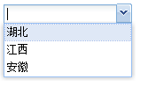
首先從服務(wù)器獲取json數(shù)據(jù):
 //cs后臺(tái)代碼,簡(jiǎn)單起見,示例而已,要主要字符串格式(新手注意,下面的代碼放在類里面,不是放在方法里) //cs后臺(tái)代碼,簡(jiǎn)單起見,示例而已,要主要字符串格式(新手注意,下面的代碼放在類里面,不是放在方法里)
public string ServerData="['湖北','江西','安徽']";
//aspx前臺(tái)js介紹代碼
  Ext.onReady(function() Ext.onReady(function() { {
  var combo=new Ext.form.ComboBox({ var combo=new Ext.form.ComboBox({
 store:<%=ServerData%>,//獲取ServerData的string值,不要用""引起來,否則就不是object數(shù)據(jù),而是字符串,這是一個(gè)很巧妙的關(guān)鍵點(diǎn):把服務(wù)器的字符串轉(zhuǎn)化為js的object數(shù)據(jù),是不是超級(jí)方便。 store:<%=ServerData%>,//獲取ServerData的string值,不要用""引起來,否則就不是object數(shù)據(jù),而是字符串,這是一個(gè)很巧妙的關(guān)鍵點(diǎn):把服務(wù)器的字符串轉(zhuǎn)化為js的object數(shù)據(jù),是不是超級(jí)方便。
emptyText:'請(qǐng)選擇一個(gè)省份.',
applyTo: 'combo'
 }); });
 }); });
//aspx前臺(tái)html代碼
<input type="text" id="combo" size="20"/>
我們就通過<%=ServerData%>這樣的方式獲取到了服務(wù)器最簡(jiǎn)單的屬性數(shù)據(jù)。問題來了,js和html怎么調(diào)用c#后臺(tái)
的變量和方法?(變量的調(diào)用上面剛剛介紹)
7.ComboBox的數(shù)據(jù)源store格式詳解
在前面的例子里面,我們一直給ComboBox的數(shù)據(jù)源store賦值一維數(shù)組,其實(shí)store支持多維和Store.data.Store類型。
//下面就幾種數(shù)據(jù)以代碼舉例說明
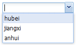
1.一維數(shù)組:["江西","湖北"],值同時(shí)賦給ComboBox的value和text
2.二維和多維數(shù)組:[["one","bbar","111"],["two","tbar","222"]],第一維和第二維分別賦值給value和text,其他維忽略
3.store類型:包括GroupingStore, JsonStore, SimpleStore.
//我們分三步走:
//第一步:提供數(shù)據(jù):
var data=[['湖北','hubei'],['江西','jiangxi'],['安徽','anhui']];
//第二步:導(dǎo)入到store中:
var store = new Ext.data.SimpleStore({
fields: ['chinese', 'english'],
data : data
});
//第三步 :把store托付給comboBox的store
var combo = new Ext.form.ComboBox({
store: store,
displayField:'english',//store字段中你要顯示的字段,多字段必選參數(shù),默認(rèn)當(dāng)mode為remote時(shí)displayField為undefine,當(dāng)select列表時(shí)displayField為"text"
mode: 'local',//因?yàn)閐ata已經(jīng)取數(shù)據(jù)到本地了,所以'local',默認(rèn)為"remote",枚舉完
emptyText:'請(qǐng)選擇一個(gè)省份',
applyTo: 'combo'
});
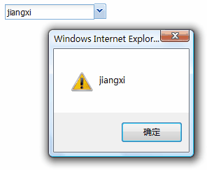
8.ComboBox的value獲取
//ComboBox的事件很多(api),我們無法一一講解,但是我們可以舉一反三,select事件就是其中典型的一個(gè)
listeners:{
"select":function(){
alert(Ext.get("combo").dom.value); //獲取id為combo的值
}
}
//這里我們提供了一種不是很好的方法,在此不做過多停留
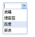
9.把Extjs的ComboBox樣式應(yīng)用到select的下拉框中去
核心參數(shù)介紹
transform:id//用于轉(zhuǎn)換樣式的,TimeField作為ComboBox的子類也有此屬性
核心代碼:
//js代碼
var ExtSelect=new Ext.form.ComboBox({
transform:"select",//html中的id
width:80//寬度
});
//html代碼
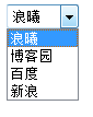
<select id="select">
<option value="1">浪曦</option>
<option value="2">博客園</option>
<option value="3">百度</option>
<option value="4">新浪</option>
</select>
//是不是超級(jí)簡(jiǎn)單?
  10.ComboBox的其他重要參數(shù)
1.valueField:"valuefield"//value值字段
2.displayField:"field" //顯示文本字段
3.editable:false//false則不可編輯,默認(rèn)為true
4.triggerAction:"all"//請(qǐng)?jiān)O(shè)置為"all",否則默認(rèn)為"query"的情況下,你選擇某個(gè)值后,再此下拉時(shí),只出現(xiàn)匹配選項(xiàng),如果設(shè)為"all"的話,每次下拉均顯示全部選項(xiàng)
5.hiddenName:string //真正提交時(shí)此combo的name,請(qǐng)一定要注意
6.typeAhead:true,//延時(shí)查詢,與下面的參數(shù)配合
7.typeAheadDelay:3000,//默認(rèn)250
//其他參數(shù),請(qǐng)參考api,或自行嘗試
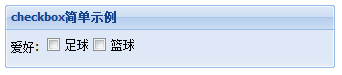
11.checkbox簡(jiǎn)單示例
Ext.onReady(function(){
Ext.QuickTips.init();
var myform=new Ext.FormPanel({
frame:true,
width:330,
layout:"form",
labelWidth:30,
title:"checkbox簡(jiǎn)單示例",
labelAlign:"left",
renderTo:Ext.getBody(),
items:[{
xtype:"panel",
layout:"column",//也可以是table,實(shí)現(xiàn)多列布局
fieldLabel:'愛好',
isFormField:true,//非常重要,否則panel默認(rèn)不顯示fieldLabel
items:[{
columnWidth:.5,//寬度為50%
xtype:"checkbox",
boxLabel:"足球",//顯示在復(fù)選框右邊的文字
name:""
},{
columnWidth:.5,
xtype:"checkbox",
boxLabel:"籃球",
name:""
}]
}]
});
});
關(guān)于多列布局,我們可以使用column或者table布局解決!
//其他幾個(gè)參數(shù)
1.checked:true//true則選中,默認(rèn)為false
2.name:"**"//name值
3.value:""//初始化值,默認(rèn)為undefine
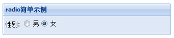
12.radio簡(jiǎn)單示例
基本上和checkbox一樣,不過注意一組單選框必須name值相同,才能單選。
//基本同上,不做過多解釋
Ext.onReady(function(){
Ext.QuickTips.init();
var myform=new Ext.FormPanel({
frame:true,
width:330,
layout:"form",
labelWidth:30,
title:"radio簡(jiǎn)單示例",
labelAlign:"left",
renderTo:Ext.getBody(),
items:[{
xtype:"panel",
layout:"column",
fieldLabel:'性別',
isFormField:true,
items:[{
columnWidth:.5,
xtype:"radio",
boxLabel:"男",
name:"sex"
//inputValue
},{
columnWidth:.5,
checked:true,
xtype:"radio",
boxLabel:"女",
name:"sex"
}]
}]
});
});
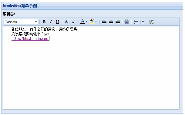
13.htmleditor簡(jiǎn)單示例
//基本上同上
Ext.onReady(function(){
Ext.QuickTips.init();
var myform=new Ext.FormPanel({
frame:true,
width:600,
layout:"form",
labelWidth:50,
title:"htmleditor簡(jiǎn)單示例",
labelAlign:"top",//items中的標(biāo)簽的位置
renderTo:Ext.getBody(),
items:[{
xtype:"htmleditor",
id:"he",
fieldLabel:"編輯器",
anchor:"99%"
}]
});
});
在這里我啰嗦個(gè)參數(shù):
//labelAlign參數(shù)
labelAlign:此參數(shù)是指form表單中items各項(xiàng)的label位置,默認(rèn)值為left,枚舉值有l(wèi)eft,right,top
//我看見過有朋友認(rèn)為此參數(shù)指title的位置,是錯(cuò)誤的!
幾個(gè)其他的參數(shù):
//補(bǔ)充幾個(gè)參數(shù)
1.hideLabel:true//默認(rèn)為false,還適用于有標(biāo)簽的所有表單組件
//下面的一組參數(shù)控制編輯器的工具欄選項(xiàng),都是默認(rèn)值為true
2.enableColors:true//默認(rèn)為true,顯示字體顏色,字體背景顏色
3.enableAlignments:true//左,中,右對(duì)齊
4.enableFont:true//字體
5.enableFontSize:false//字體大小,就是A旁邊有個(gè)小箭頭的
6.enableFormat:false//粗體,斜體,下劃線
7.enableLinks:true//鏈接
8.enableLists:true//列表
9.enableSourceEdit:true//源代碼編輯
14.datefield簡(jiǎn)單示例
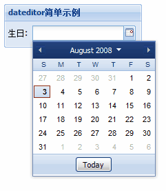
Ext.onReady(function(){
Ext.QuickTips.init();
var myform=new Ext.FormPanel({
frame:true,
width:200,
layout:"form",
labelWidth:30,
title:"dateditor簡(jiǎn)單示例",
labelAlign:"left",
renderTo:Ext.getBody(),
items:[{
xtype:"datefield",
fieldLabel:"生日",
anchor:"99%"
}]
});
});
17.triggerfield簡(jiǎn)單示例
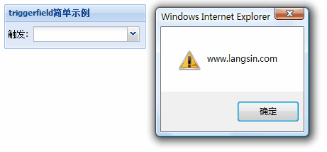
Ext.onReady(function(){
Ext.QuickTips.init();
var myform=new Ext.FormPanel({
frame:true,
width:200,
layout:"form",
labelWidth:30,
title:"triggerfield簡(jiǎn)單示例",
labelAlign:"left",
renderTo:Ext.getBody(),
items:[{
xtype:"trigger",
fieldLabel:"觸發(fā)",
anchor:"99%",
onTriggerClick:function(e){
//在這里寫你要實(shí)現(xiàn)的事件,很容易擴(kuò)展
alert("www.langsin.com");
}
}]
});
});
好了,關(guān)于form的幾個(gè)基本組件我們都蜻蜓點(diǎn)水的看了一遍,相信大家感性上知道是怎么回事啦!(總算快寫完了formpanel)
前面有朋友說要做個(gè)一行多個(gè)控件,中間有文字的那種form布局,謝謝支持!

|