Java的Border是用來呈現(xiàn)圍繞Swing組件邊緣邊框的對(duì)象,它本身是一個(gè)接口,里面定義了paintBorder、getBorderInsets和isBorderOpaque三個(gè)需要實(shí)現(xiàn)的方法.如果想用自己的Border類來繪制組件的邊框,必須實(shí)現(xiàn)這三個(gè)方法,里面有很多布局和繪制的問題,比較麻煩.
Java為了方便使用,提供了虛擬類AbstractBorder,繼承它就可以比較簡(jiǎn)單的實(shí)現(xiàn)自己的邊框了,但還是有布局和重繪以及組件位置的問題需要自己實(shí)現(xiàn),為此Java又提供了EmptyBorder、CompoundBorder、EtchedBorder、LineBorder、MatteBorder和TitledBorder為我們可以使用的大部分Border提供了實(shí)現(xiàn),并且創(chuàng)立了工廠類BorderFactory為各種Border實(shí)現(xiàn)提供實(shí)例.
對(duì)于普通的Border,Java的BorderFactory已經(jīng)滿足我們的要求了,但是如果我們需要的是特殊的Border,比如Border的標(biāo)題是一個(gè)單選框,就必須使用我們自己的類來實(shí)現(xiàn)了.這里我們可以把我們需要繪制的Border也想象成一個(gè)容器,在它的基礎(chǔ)上繪制出自己的邊緣,需要填充的組件在放置在它的上面就可以了.
先看比較簡(jiǎn)單的例子,Sun官方給出了使用的普通例子:
圖如下:
依次創(chuàng)建了
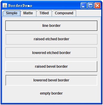
①
實(shí)現(xiàn)單色、任意厚度線邊框
BorderFactory.createLineBorder(Color.black);
②
具有“浮雕化”外觀效果的邊框(效果為凸起)
BorderFactory.createEtchedBorder(EtchedBorder.RAISED);
③
具有“浮雕化”外觀效果的邊框(效果為凹陷)
BorderFactory.createEtchedBorder(EtchedBorder.LOWERED);
④
具有凸出斜面邊緣的邊框
BorderFactory.createRaisedBevelBorder();
⑤
具有凹入斜面邊緣的邊框
BorderFactory.createLoweredBevelBorder();
⑥
不占用空間的空邊框
BorderFactory.createEmptyBorder();

①
多層指定圖標(biāo)組成的、類似襯邊的邊框
BorderFactory.createMatteBorder(-1,
-1, -1, -1, icon)
②
純色創(chuàng)建一個(gè)類似襯邊的邊框
BorderFactory.createMatteBorder(1, 5,
1, 1, Color.red);
③
多層指定圖標(biāo)組成的、類似襯邊的邊框(只有一個(gè)邊有框)
BorderFactory.createMatteBorder(0, 20,
0, 0, icon);
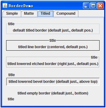
①
創(chuàng)建一個(gè)空標(biāo)題的新標(biāo)題邊框,使其具有指定的邊框?qū)ο蟆⒛J(rèn)的文本位置(位于頂線上)、默認(rèn)的調(diào)整 (leading),以及默認(rèn)的字體和文本顏色(由當(dāng)前外觀確定)
BorderFactory.createTitledBorder("title");
②
向現(xiàn)有邊框添加一個(gè)標(biāo)題,使其具有默認(rèn)的位置(位于頂線上)、默認(rèn)的調(diào)整 (leading),以及默認(rèn)的字體和文本顏色(由當(dāng)前外觀確定)
BorderFactory.createTitledBorder(BorderFactory.createLineBorder(Color.black), "title");
BorderFactory.createTitledBorder(BorderFactory.createEtchedBorder(EtchedBorder.LOWERED), "title");
BorderFactory.createTitledBorder(BorderFactory.createLoweredBevelBorder(),
"title");
BorderFactory.createTitledBorder(BorderFactory.createEmptyBorder(),
"title");
然后通過Border的方法設(shè)置它們的位置和顯示屬性:
border.setTitleJustification(TitledBorder.CENTER);
border.setTitlePosition(TitledBorder.ABOVE_TOP);
③
當(dāng)然也可以再構(gòu)造時(shí)給出這些屬性.
向現(xiàn)有邊框添加一個(gè)標(biāo)題,使其具有指定的位置、字體和顏色
BorderFactory.createTitledBorder(BorderFactory.createLineBorder(Color.black), "title", TitledBorder.CENTER, TitledBorder.ABOVE_TOP, new Font("宋體", Font.BOLD, 12);,Color.Red);
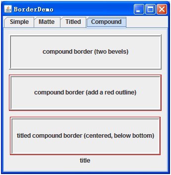
創(chuàng)建一個(gè)合成邊框,指定了用于外部和內(nèi)部邊緣的 border 對(duì)象
BorderFactory.createCompoundBorder(raisedbevel,
loweredbevel);
內(nèi)外Border可以任意組合,也可以為Null.
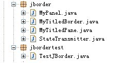
接下來就是自己實(shí)現(xiàn)一個(gè)有特殊表現(xiàn)形式的Border了,最基礎(chǔ)的方法是實(shí)現(xiàn)Border接口,實(shí)現(xiàn)paintBorder、getBorderInsets和isBorderOpaque三個(gè)方法,這樣比較復(fù)雜,因?yàn)槲覀円薷牡氖?/span>Border的Title,所以這里我繼承TitledBorder:
/**
* the title border that override it.
*/
publicclass MyTitledBorder extends TitledBorder {
它有一個(gè)屬性:
/**
* the component in the
border.
*/
protected JComponent component = null;
代表放置在Border上的組件.
再看它的構(gòu)造函數(shù):
/**
* Creates a TitledBorder
instance.
*/
public MyTitledBorder(JComponent component) {
this(null, component, LEFT, TOP);
}
public MyTitledBorder(Border border, JComponent component,
int titleJustification, int titlePosition) {
super(border, null, titleJustification, titlePosition, null, null);
this.component = component;
if (border == null) {
this.border = super.getBorder();
}
}
它把Border上的組件傳入,并設(shè)置初始位置.
然后是實(shí)現(xiàn)Border的部分方法,設(shè)置JComponet的位置,大小和布局等.
/**
* Reinitialize the insets
parameter with this Border's current Insets.
*/
@Override
public Insets
getBorderInsets(Component c, Insets insets) {
用此邊框的當(dāng)前 Insets 重新初始化 insets 參數(shù).
insets.top = EDGE_SPACING + TEXT_SPACING + borderInsets.top;
insets.right = EDGE_SPACING + TEXT_SPACING + borderInsets.right;
insets.bottom = EDGE_SPACING + TEXT_SPACING + borderInsets.bottom;
insets.left = EDGE_SPACING + TEXT_SPACING +
borderInsets.left;
然后在根據(jù)Border的位置設(shè)置它的準(zhǔn)確邊界:
先是得出Border上組件的大小:
if (component != null) {
compHeight = component.getPreferredSize().height;
}
然后根據(jù)位置計(jì)算邊:
caseBELOW_TOP:
insets.top += compHeight + TEXT_SPACING;
然后是
/**
* Paints the border for the specified
component with the specified * position and size.
*/
@Override
publicvoid
paintBorder(Component c, Graphics g, int x, int y, int width, int height) {
按照指定的位置和大小為指定的組件繪制邊框.
先得出沒有邊框的容器的大小:
Rectangle borderR = new Rectangle(x + EDGE_SPACING, y + EDGE_SPACING,
width - (EDGE_SPACING * 2),
height - (EDGE_SPACING * 2));
然后得出邊框的大小和邊框上組件的大小:
Insets insets =
getBorderInsets(c);
Rectangle compR = getComponentRect(rect, insets);
然后根據(jù)Border上組件的位置,計(jì)算哪兒應(yīng)該加上這個(gè)大小:
例如在下面,意味著下面的Border會(huì)寬一點(diǎn):
caseBOTTOM:
diff = insets.bottom / 2 - borderInsets.bottom - EDGE_SPACING;
borderR.height -= diff;
最后是繪制:
border.paintBorder(c, g,
borderR.x, borderR.y, borderR.width,
borderR.height);
Color col = g.getColor();
g.setColor(c.getBackground());
g.fillRect(compR.x, compR.y, compR.width, compR.height);
g.setColor(col);
component.repaint();
最后一個(gè)方法是根據(jù)Border上組件和Border的Insets計(jì)算現(xiàn)在組件的寬度和最終組件要占據(jù)的位置大小:
/**
* get component Rectangle.
*/
public Rectangle
getComponentRect(Rectangle rect, Insets borderInsets) {
先得出不算Boder和Insets組件的大小:
Dimension compD = component.getPreferredSize();
Rectangle compR = new Rectangle(0, 0, compD.width, compD.height);
然后根據(jù)位置進(jìn)行換算,比如組件位于Border的下-右:
caseBELOW_TOP:
compR.y = borderInsets.top - compD.height - TEXT_SPACING;
caseRIGHT:
compR.x = rect.width - borderInsets.right - TEXT_INSET_H
-
compR.width;
最后把算好的compR返回就可以了.
接著是一個(gè)接口,用處主要是標(biāo)示Border內(nèi)的所有組件是否可用,當(dāng)然以后也可以添加新的接口:
/**
* set the panel enable or not.
*/
publicinterface StateTransmitter {
它只有一個(gè)需要實(shí)現(xiàn)的方法:
/**
* set panel enable.
*/
publicvoid
setChildrenEnabled(boolean enable);
用來管理Border內(nèi)的所有組件是否可用的.
然后是這個(gè)接口的一個(gè)簡(jiǎn)單實(shí)現(xiàn),我們所有的組建需要放置在它的上面,當(dāng)然你也可以自己實(shí)現(xiàn),只需要實(shí)現(xiàn)StateTransmitter接口就可以了:
/**
* the panel that you can override it.<br>
* if you want your panel title can change the
panel state,you must override
*/
publicclass MyPanel extends JPanel implements
StateTransmitter {
它只有一個(gè)實(shí)現(xiàn)方法,其它和Jpanel相同:
@Override
publicvoid setChildrenEnabled(boolean enable) {
Component[] children = this.getComponents();
for (int i = 0; i < children.length; i++) {
children[i].setEnabled(enable);
}
}
最后就是把自己寫好的MyTitledBorder類放置到指定JPanel組合成最終我們可以使用的特殊Border類了.
publicclass MyTitledPane extends JPanel {
它就是一個(gè)普通的JPanel,我們?cè)谒纳厦娣胖昧俗约憾x的特殊Border和我們以后需要放置的其他組件根容器,然后通過調(diào)整它的doLayout方法和setEnabled方法使它滿足我們的要求.
它的屬性如下:
/**
* panel border.
*/
private MyTitledBorder border = null;
/**
* the component in the
title pane.
*/
private JComponent component = null;
/**
* the title pane.
*/
private JPanel panel = null;
/**
* is enable allow.
*/
privatebooleantransmittingAllowed = false;
/**
* enable or not.
*/
private StateTransmitter transmitter = null;
然后是它的構(gòu)造函數(shù),在構(gòu)造函數(shù)里我們需要初始化我的定制的特殊的Border和可以放置其它組件的根容器.
public MyTitledPane(JComponent
component) {
border = new MyTitledBorder(component);
setBorder(border);
panel = new JPanel();
add(component);
add(panel);
設(shè)置可用與否的初始值:
transmittingAllowed = false;
transmitter = null;
然后提供一個(gè)可以換Border上容器的方法:
/**
* remove old component and
add new one.
*/
publicvoid setTitleComponent(JComponent
newComponent) {
remove(component);
add(newComponent);
border.setTitleComponent(newComponent);
component = newComponent;
}
接著重寫JPanel的setEnabled方法使它的子組件也不可用:
@Override
publicvoid setEnabled(boolean enable) {
super.setEnabled(enable);
if (transmittingAllowed && transmitter != null) {
transmitter.setChildrenEnabled(enable);
}
}
最后是重寫JPanel的doLayout方法,使布局自適應(yīng):
/**
* reset the pane layout.
*/
@Override
publicvoid doLayout() {
先取得它的邊:
Rectangle rect = getBounds();
再去的Border的邊:
Rectangle compR = border.getComponentRect(rect, insets);
component.setBounds(compR);
兩者去做合并:
rect.x += insets.left;
rect.y += insets.top;
rect.width -= insets.left + insets.right;
rect.height -= insets.top + insets.bottom;
最后設(shè)置新的Layout的邊:
panel.setBounds(rect);
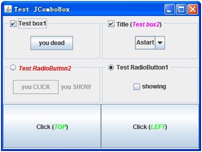
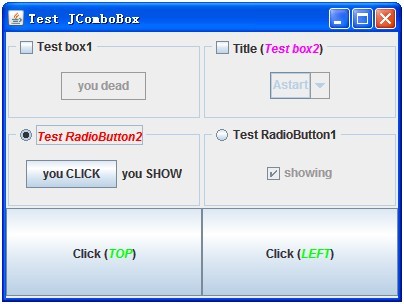
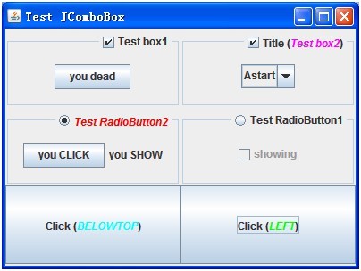
到此為止,一個(gè)我們自定義的特殊Border就完成了,我們可以如下使用它:
final MyTitledPane
mypane = new MyTitledPane(mycheBox);
然后定義我們的JPanel,把它放置在Bordr面板上.
MyPanel userPanel = new MyPanel();
userPanel.add(new JButton("you add"));
mypane.setTransmittingAllowed(true);
mypane.setTransmitter(userPanel);
mypane.getContentPane().add(userPanel);
到此完成.